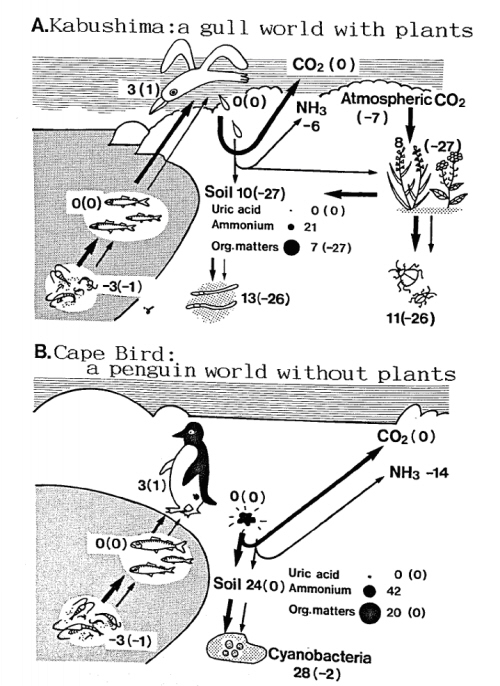
 The latest edition of my Great Diagrams of Science series comes from a field near and dear to my heart- using stable isotope analysis to map a food web. Japanese scientists Wada, Mizutani, and Minagawa got the opportunity to study the feeding ecology of penguins in Antarctica, and were some of the first researchers to use stable isotopes for food web analysis. To travel so far and use what was at the time (1991) state-of-the-art technology, they must have received an impressively large grant. Their results played a part in revolutionizing how scientists study food web interactions, so the grant money was well spent in that regard.
However, it seems that none of it was spent on graphic design:

If you look closely, you can clearly see that one of the central components of this ecosystem is bird poop. To ecologists, this makes perfect sense- nutrients from animal excrement are extremely important in the growth of plants and various biogeochemical cycles. This may, however, be one of the rare cases when a scientific point is best made with words instead of graphics.
This blog entry brought me a little slice of happiness tonight (I’ve got a spicy date with my thesis tonight, what do you expect?) because I, too, am using stable isotopes to map out a marine food web. I feel myself inspired, in the nerdiest way imaginable, to create a diagram of my own in lieu of all this writing and in honour of a study that paved the way, at the very least, to my graduate work 🙂 Thanks for posting.
Christine, what is the focus of your research? Where do you study?
I’ll spare everyone my own horrible drawing ability, but if you send me your handmade diagram I’ll post it on the blog.